Monday, 31 October 2011

Research: Still Life - Ray Massey

I think Ray Massey's still life photography is amazing, it's creative and it looks great fun.
Some of the things he has created with everyday objects is extraordinary for example this photograph -the pot of pencils 
 I really like how Ray Massey has used fingers to substitute for pencils, pens and paintbrushes. I also like how their not in a perfect straight order they look like they have just been stuck in in any random way. The detail and colours painted on the fingers make it look realistic and at first when i quickly glanced i thought that some were real and some were fingers. Its almost an optical illusion and i think its great. 
I also like the composition of the hand(pot) its in the middle and the fingers and are coming out of it in all directions like an explosion.
I was also pleased with this image:
it's scary but quite pleasant at the detail of the snake from the teeth to its scales and eyes. I don't know if it is a real snake but it definitely looks like it is. I think the focus point is the fangs and the tip of the nose as its in the middle of the image.The lighting on the snakes teeth makes more interesting because if it was all just red it might look a bit plain. The snakes head gives a bumpy texture and i don't know what it was created with but it looks like wax and that gives a smooth texture look.
I think Ray Massey chose that angle because its very effective by making the audience wonder what the snake was pouncing at. Also the amount of space left around the snakes head is intriguing but perfect because if he chose to make less space then the image wouldn't be as effective as it would look like part of it was cut off.
I like the range of material Ray Massey uses too from the wax looking material for the snake  and to a toothbrush like this image:
I feel that Ray Massey using water bottles as a substitute for the bristles of a toothbrush is ironic but hilarious at the same time because you put water on a toothbrush. Also like this image:
This too is just clever and also a different way of thinking as we always expect water to come out but would be shocked if miniature water bottles came out with the water. 
Both these images have the horizontal lines from tiles in the background leading to the the toothbrush or to the tap. And the vertical lines represent the water bottles for example in the first image the bottles are stood upright and in the second image they are falling out of a tap.
Another material i thought was ironic was the Uncle Ben's rice:
I think this image is ironic because Uncle Ben makes rice and to have the picture of Uncle Ben made from rice is great. 

Again I like all of Ray Massey's photographs and they are very clever, funny and great.

Sunday, 30 October 2011

Research: Portraits - Michael Robert Williams


I like Michael Williams photographs because of all the different angles he uses to take the photographs instead of using the typical angle of straight on head and shoulders. I think this makes images very interesting for example this image:
 Out of all Michael's images this one is my favourite because although the model's whole body is in the image Michael has chosen to focus only on the top half of her body, her face with a soft light shining there leaving the rest of her body in the dark. I think Michael's intention was that maybe because that is the normal shot for a portrait photograph.
I also like the way she is positioned its different from the rest of them and there is also a lot of space around her body maybe to suggest she's lonely. Also her body takes the position and direction of the staircase which is a really nice effect because it makes you wonder if she was placed like that on purpose.In my personal opinion what makes all his photographs good is because they all have different layouts and its intriguing, like this image for example 
 I like the angle that the photograph has been taken and the contrast of backgrounds behind the subject. It looks like he's going to run a race or something and with the sun behind his hand its like he has the power to do whatever he wants.
Another thing I like about Michael William's images is he uses real settings for example 
I like how the subjects look like they are working but i also like how apart from the picture of Marilyn Monroe the focus is on the two subjects. I also like how the image leads the eye from the bottom left hand corner to the subjects off centre.

I really like the background in this image but I think it takes the focus off the subject.
This photograph looks great because of the depth of field. When I look at this image I am drawn to the blurriness at the bottom of the image and then I follow it up to the subject. Also the tree's and buildings in the background create a line pointing to the subject so whichever part of the photograph you look at the lines draw you to the subject.

I also like how apart from  a wide shot he also does close ups like these:
 In this image i find it interesting how the subject is looking away from the camera almost wanting the viewers to look over there to see what he's looking at.
In this image i like how the subject is using direct eye contact with the camera signifying that he is confident and has power.


I think that Michael Williams photographs are very appealing and they look great because of the wide variety he has done. 


Saturday, 29 October 2011

Research: Fashion- Jason Christopher

I like most of Jason Christopher's images,I particularly like this image because of the models facial expression and the way her hair sticks out. it creates the crazy fun look which it might be because she's happy and it might relate to the fact that she's modelling a new fashion line which bring me onto her position. Not only is her dress in the centre of the image but the position she's in is like she's showing off the dress which captures the theme of fashion very well. 
 I also like how the photographs focus on the models by choosing less detailed or simple backgrounds to make the models stand out and the focus be on them. 
I really really like this image because its simple but cute and its an effective image to make people buy this dress so people will look like these models. 
I also like the use of colour in some of his images for example this image its really focusing on the fashion side instead of the model because the colour of the clothes are bold and daring.
I also like how he experiments with different effects for example he uses normal coloured images but also black and white images, magazine covers and using colours of clothing and backgrounds to make it almost look like its a black and white image like this one:


What i don't like about Jason Christopher's images is that all the women are half naked and too thin. I think that its slightly degrading to women that they have to be half naked to sell  clothes.
For example these photographs:


I think that if the models were more clothed it would be better unless their selling underwear then in that case they should not make the images so seductively. 
Also Jason Christopher shouldn't always use stick thin models because there is a lot of pressure on normal sized girls to be exactly like models even if it means starving themselves to death. 
I also did not like how there was only a few male model photographs when there was so many women photographs. There should be a balance of the equal amount of men and women photographs.


Also some of the images were a bit scary like these:

Although i have seen many images like this and im sure other people like them but i don't like these images because the models in them look too scary and demonic. On the other hand i do like the composition of the models i think that is very good.
Another thing i did not like about Jason Christopher's images is that some of the models seemed to disappear into the background because of the detail and the colours used. Like these:
 In another image like this the model is also wearing a black dress but it has some white on it which makes the dress stand out from the woodland scene.
If the model further away wasn't in this photograph i would hardly notice the other model because her top is almost the same colour as the grass in the background.

And for this image i think the car takes the focus off the model because it is far more detailed and the colour stand out whereas she does not.
I think the lighting in his photographs are great especially this image:
because he's using natural light and it gives a variety to the audience if they want natural light or artificial light.

Thursday, 27 October 2011

Task 6 - Evaluation {Low key}

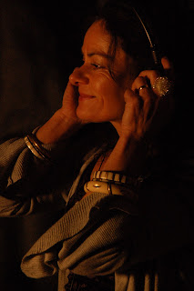
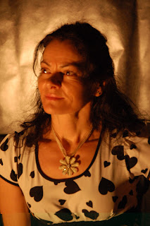
I think the photographs that i have taken fit the low key criteria apart from a few because my model was stood very close to the light and i realised after the photograph was taken but i rather liked the composition of the image so i kept them. 
I think my images are very pleasing for everyone.
I had some limitations for example the set up equipment i used. It wasn't the correct equipment to use and so it was difficult to set up. Another limitation i had was the lights were very very bright but the photos came out quite dark so i had to use a little torch just to shine on the models face making the image not as dark. 
If i had to do the low key setting again i would do some things differently for example instead of a square light id try get a circular one so the spotlight effect is better. Also i would try to get a better backdrop as we just pinned black material to the curtains. 
My low key setting was quite successful i think but next time i think id have to make the ISO settings to 800 or less so that some images dont come out so bright.

Task 4 - Produce task 3's work {Low key}


I attempted to take low key photographs with construction lights and dypril upholstery for a black back drop behing the model.


As these aren't the correct equipment i had to change the camera settings i used from the low key photography we did in class.
The camera was on manual in class and the Aperture was set to F11 i had to set it to shutter priority due to darkness.
From the ISO at 200 i had to change it to 1600 because the image turned out very dark but the lighting was very bright.

Manual ^ 1/125 F11

Aperture ^ F11 Shutter speed 1 second

Shutter Priority ^ 1/125 F4.2

I decided to use shutter priority because out of them all it was the image which came out most best.


 These images are brighter than the rest.


These images would be better if the model's eyes were open but i still like these images.